Welcome to Yannick’s Marketing Newsletter
Today's focus: using negative margins for overlapping elements and ensuring the changes carry over across all devices.

1. Adjusting Margins:
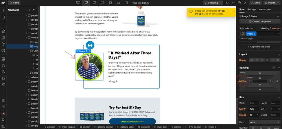
Elevate your landing page's visual appeal by using negative margins to create overlapping elements. This technique adds depth and a modern flair to your design.
Focus on Margins, Not Padding: It's crucial to adjust margins - the space outside your elements - to achieve this effect, as opposed to padding.

2. Design Consistency Across Devices:
Verify on All Screens: An overlap that looks fantastic on a desktop might be problematic on a mobile device. It's essential to check your design in Webflow's responsive modes to ensure it adapts seamlessly to different screen sizes and orientations.
Responsive Adjustments: Be prepared to tweak margin values for various devices to maintain both the aesthetic and functional integrity of your design.
3. User Experience is Paramount:
Balancing Form and Function: While overlapping elements can be visually impressive, always prioritize user experience. Ensure that your design remains intuitive and navigable on all devices.
This Week's Focus:
Create an overlapping element design on a Webflow landing page using negative margins.
Thoroughly test your design on multiple devices and orientations. Pay attention to how elements shift and adjust accordingly.
Aim for a balance between visual innovation and user-friendliness.
Successful web design in Webflow relies on attention to detail across all devices. Your designs should not only captivate but also function flawlessly, regardless of how your audience accesses your site.
Until the next edition,
Yannick Lyons
Yannick’s Marketing Newsletter
